Destination Rumination
Commentary:
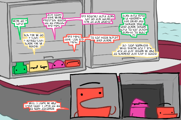
These people were not meant to lie down. Their faces just don’t work that way. This is a kind of text-heavy page, but I think the layout is more interesting than usual, with the smaller panels inside of the larger image. I should do that kind of thing more often. The fact that their word balloons are all different colors, besides helping you keep track of who is talking, especially in the case of the last two for Green and Yellow where I didn’t bother to even put tails on the balloons, is nice because if they were all just black outlined balloons it would look boring.


Discussion ¬